MIRR
Original Product
Outcome
Start with what shipped and what improved — then read the story only if you want to go deeper.
Deliverables
Results
- What improved: Clearer narrative & calmer hierarchy
- Delivery: Reusable components + layout system
- Quality: Better consistency across sections
Role
Creative direction, UI, and brand identity.
Case study
A fixed structure that scales as your portfolio grows.
Context
A modular platform that helps creators present their practice with depth. Focused on calm typography and intentional spacing.
Problem
The initial experience lacked a clear story and the hierarchy made it hard to understand the value quickly.
- Narrative unclear
- Inconsistent layout rhythm
- Missing reusable components
Approach
We aligned on a minimal, calm visual system and prioritized a readable structure that scales as content grows.
- Define a stable component set
- Focus on typography & spacing
- Design for real content density
Process
A small number of high-signal iterations: wireframe → UI system → build → polish.
- Wireframe key flows
- Create UI kit / tokens
- Implement + QA
- Ship and iterate
Deliverables
What was shipped as part of this work.
- Brand System
- UI Design
- Launch Assets
Impact
The outcome is a more coherent experience that reads well, ships well, and can evolve without breaking.
Learnings
Strong systems are more valuable than one-off perfection. Consistency beats complexity.
Credits
Direction, design, and implementation by the MIRR Guild team.
- Luna Minote
- Contributors (TBD)
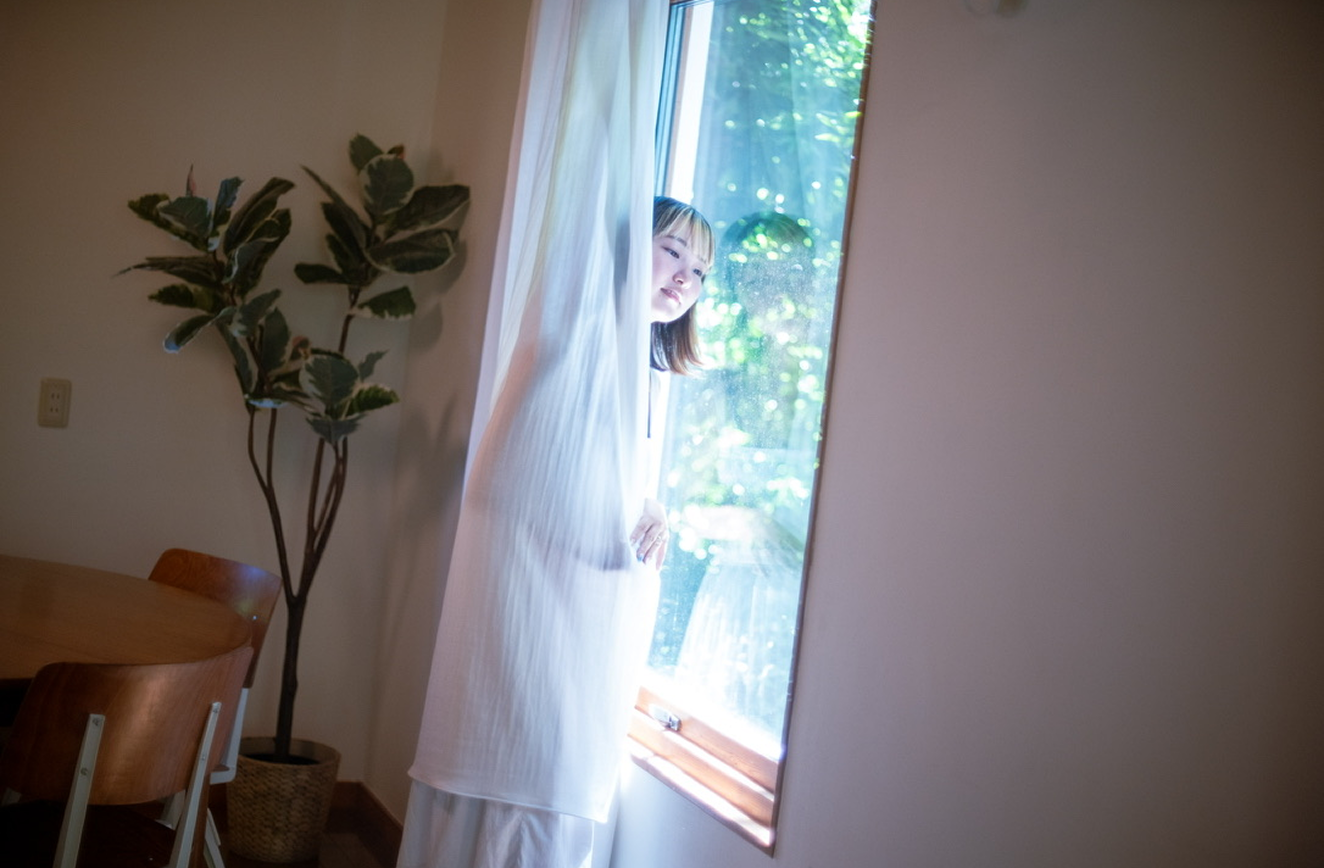
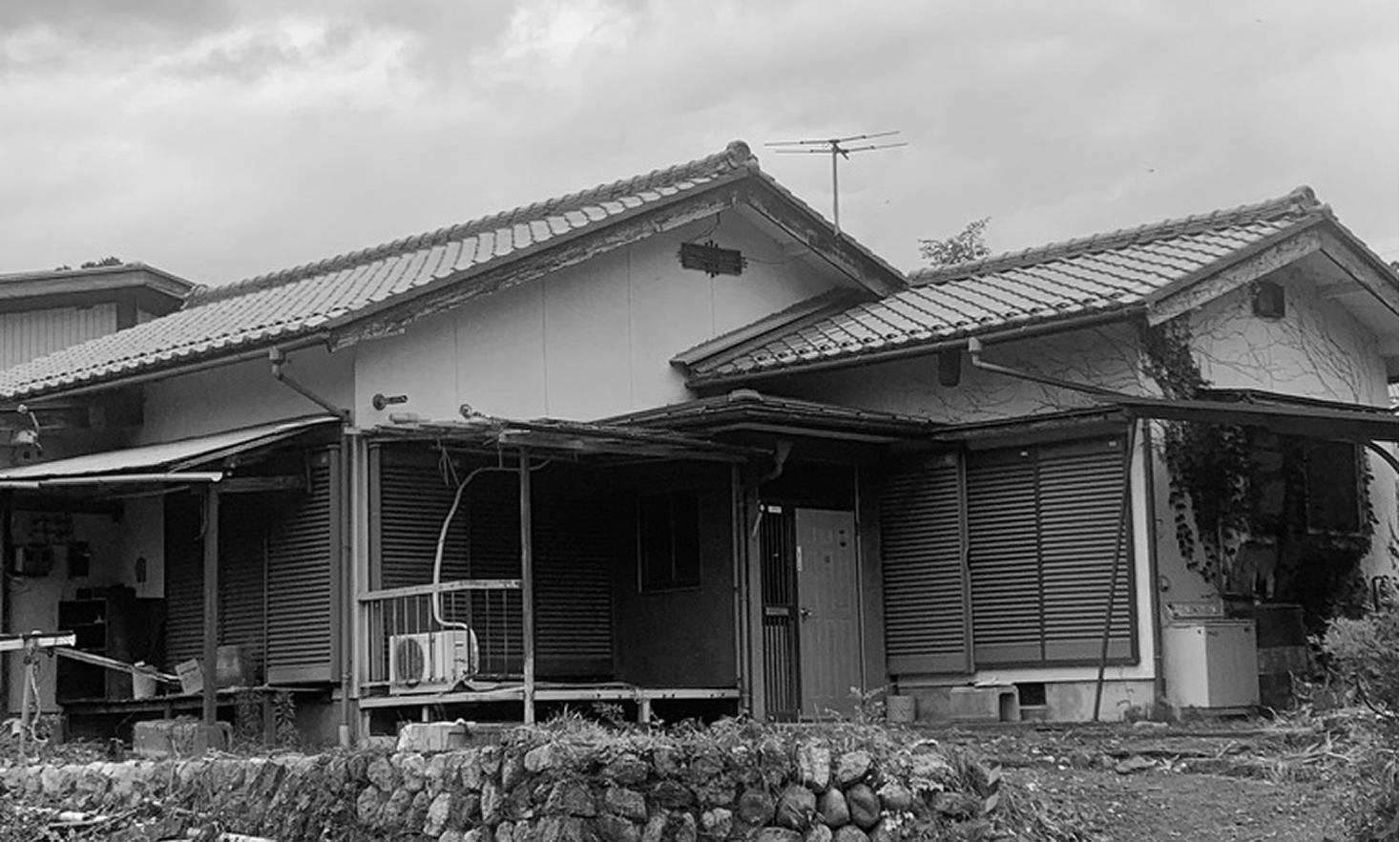
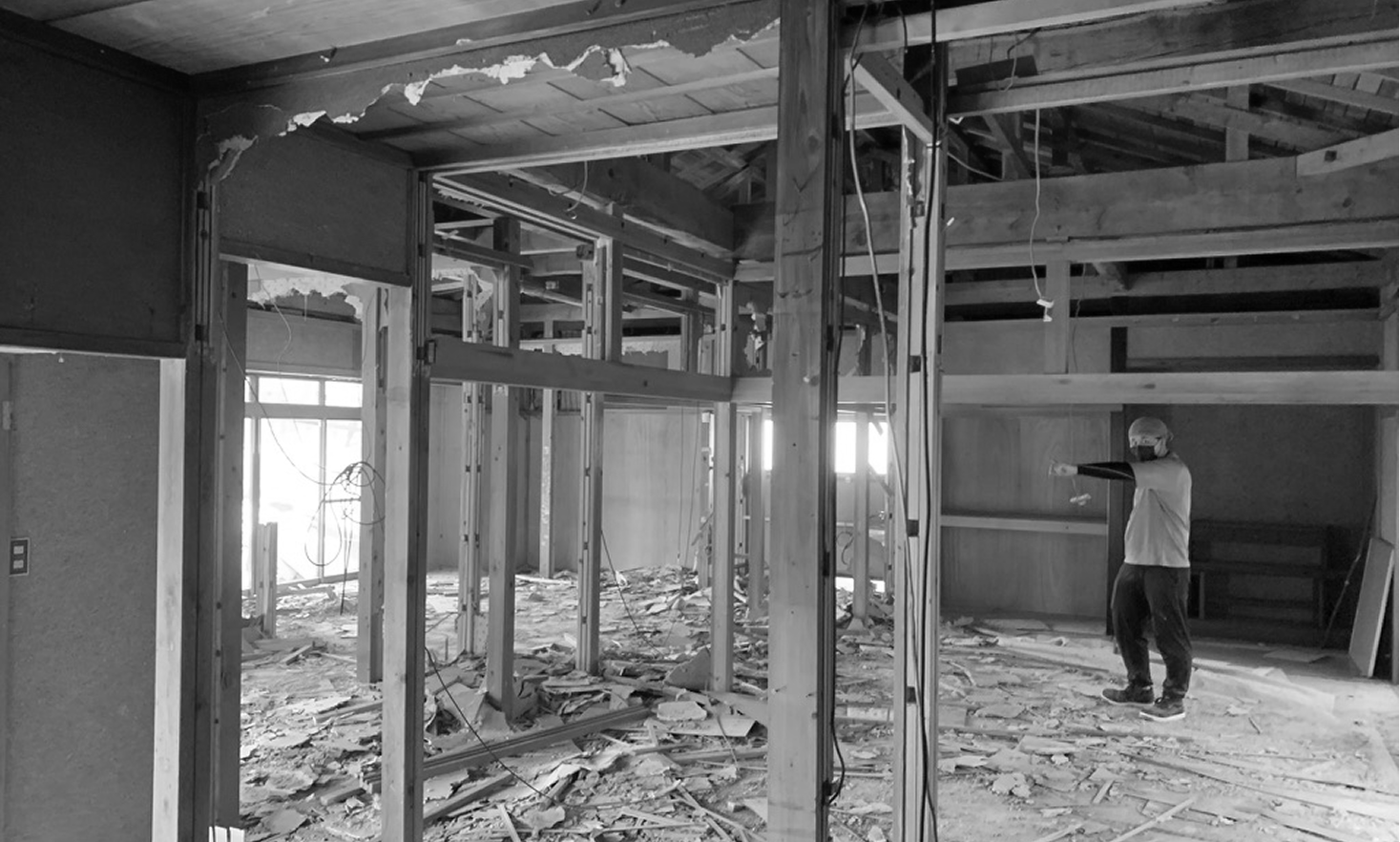
Gallery
Mix 2-column rhythm with occasional full-width inserts (flex-only).
Related
More works in similar tone, and optionally the project behind it.

Ask about this work
Not a sales pitch — just a clean way to start a conversation about the process, decisions, and constraints.